How to Graph a Function From Scratch: Paper and Screens

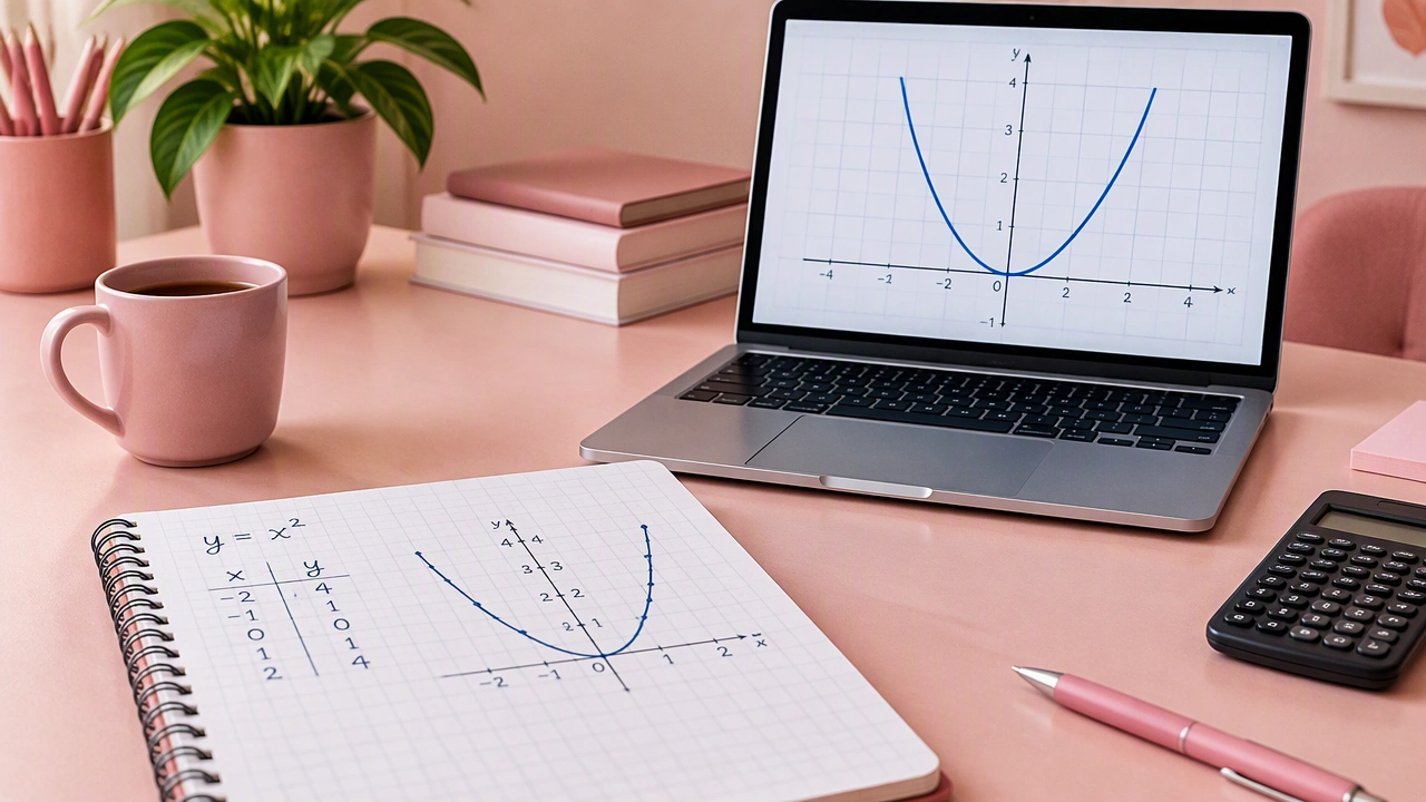
This step by step guide to graphing functions by hand and online starts with one ordinary idea: a graph is a picture of pairs. Each pair joins an input to an output, and each pair becomes a dot on a coordinate plane. We will build a graph one point at a time, first on paper and then with a digital tool. The goal is not speed. It is to see how math functions turn rules into shapes.
Start with the rule and the plane
Choose a simple function to practice. Use f(x) = x2 – 4. The input is x, and the output is f(x), often written y. Before plotting, decide which x-values are sensible. Here, any real number is allowed, so the domain is all real numbers. In practice, a small window such as -3 to 3 gives a useful first view.
On graph paper, draw a horizontal x-axis and a vertical y-axis. Mark the origin where they cross. Choose a scale that keeps your points on the page. A scale of one grid square per unit works well for this example. Label the axes and write the scale, such as 1 square = 1 unit, so your work stays readable.
Make a table of points
A table turns the rule into a list of coordinates. Pick x-values that are easy to compute and spread them across your chosen interval. For each x, calculate y = x2 – 4 and write the pair (x, y).
- x = -3: y = (-3)2 – 4 = 9 – 4 = 5, so plot (-3, 5).
- x = -2: y = (-2)2 – 4 = 4 – 4 = 0, so plot (-2, 0).
- x = -1: y = (-1)2 – 4 = 1 – 4 = -3, so plot (-1, -3).
- x = 0: y = 02 – 4 = -4, so plot (0, -4).
- x = 1: y = 12 – 4 = -3, so plot (1, -3).
- x = 2: y = 22 – 4 = 0, so plot (2, 0).
- x = 3: y = 32 – 4 = 5, so plot (3, 5).
Notice the pattern before you draw. The outputs fall to -4 and then rise again. The pairs (-2, 0) and (2, 0) show where the graph crosses the x-axis, while (0, -4) is the lowest listed point. These observations help you check the finished curve.
Plot each pair carefully
For every row, start at the origin. Move left or right along the x-axis to the input, then move up or down to the output. Place a small dot at that location. Keep your dots light so you can adjust them if needed. After plotting all seven points, read them from left to right. You should see a symmetric dip with a minimum near x = 0.
Connect the dots with judgment
Do not use a ruler to draw straight segments between the points. The rule x2 – 4 changes smoothly, so the graph is a smooth curve. Sketch a gentle line through the dots, following the trend rather than forcing every segment. The curve should descend from the left, turn near (0, -4), and rise toward the right. Extend the ends a little beyond your table, but only where you have confidence in the pattern.
Label the curve with the function name, such as y = x2 – 4. Add a title like Graph of f(x) = x2 – 4 if space allows. A labeled graph communicates the rule and the window you chose.
Check the graph with simple tests
Use three quick checks. First, test intercepts. Setting x = 0 gives y = -4, which matches (0, -4). Setting y = 0 gives x2 – 4 = 0, so x = -2 or x = 2, matching your x-intercepts. Second, check symmetry. Replacing x with -x gives the same output, so the graph should mirror across the y-axis. Third, test a point you did not plot, such as x = 4. Since 42 – 4 = 12, the point (4, 12) should sit on the same rising path if you extend the window.
Move the same process online
Digital tools follow the same logic but calculate and connect points for you. Open a graphing calculator or graphing app, enter y = x2 – 4, and set the viewing window to match your paper version, for example x from -4 to 4 and y from -6 to 8. Plot the points (-3, 5), (-2, 0), (-1, -3), (0, -4), (1, -3), (2, 0), and (3, 5) as individual marks if the tool allows it. Compare their positions with your hand-drawn graph.
Use the trace feature to move along the curve and read coordinates. Check that at x = 2 the tool reports y = 0, and at x = 0 it reports y = -4. If the digital curve disagrees, inspect the equation for a missing square, sign error, or misplaced parenthesis. Small input mistakes often explain a large visual difference.
Adjust the window for clarity
A poor window can hide the important features of a graph. If the curve looks like a straight line, zoom out. If the minimum is off-screen, change the y-range. Keep the axes visible and choose tick marks that are easy to read. For this function, a window that includes y = -4 and the x-intercepts at -2 and 2 gives a balanced view.
Compare hand and screen results
Place your paper graph beside the digital one. Compare the vertex, intercepts, symmetry, and general width. The hand graph may be slightly uneven, but its key coordinates should agree with the screen. The digital graph may show more points, yet it still rests on the same rule. This comparison builds confidence that the process, not the tool, is doing the mathematical work.
Practice with a new function
Repeat the routine with y = 2x + 1. Choose x-values from -2 to 2, calculate the outputs, plot the pairs, and connect them. Because the rule is linear, the points should form a straight line. Then enter the equation online and verify the slope: each step of 1 in x produces a step of 2 in y. Finally, try a function with a restricted domain, such as y = 1/x, and notice how the graph breaks into separate branches. Each new example strengthens the same habit: read the rule, choose points, plot carefully, connect thoughtfully, and verify with a second method.