Home / Real-World Applications
How Polynomial and Exponential Functions Model Temperature and CO2 Records

Long-term climate records can look like a wall of numbers: yearly averages, seasonal swings, measurement gaps, and small changes that matter only when viewed across decades. Using mathematical functions to model climate change data gives us a compact way to describe those patterns, compare alternatives, and explain results without losing sight of uncertainty. This article walks through the plain steps behind two useful families of models: polynomial functions for flexible curves and exponential functions for proportional growth.
Start with the question, then choose the function
A useful model begins with a specific question. Are we asking how global mean temperature has moved since 1900? How quickly has atmospheric CO2 risen at a monitoring site? Or how a local series of summer maximum temperatures compares with a global average? The question determines the time window, the units, and the kind of function that fits naturally.
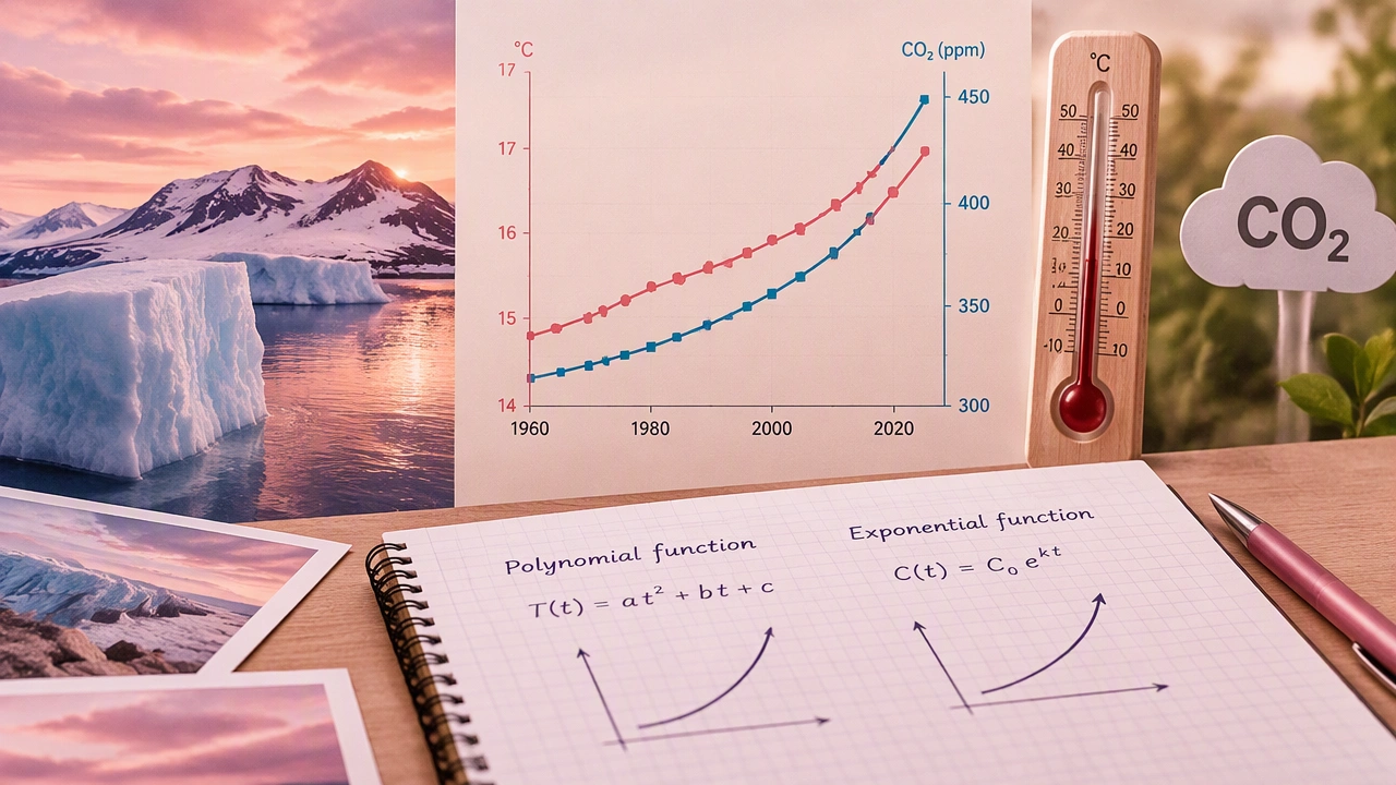
Polynomial functions are good when the trend bends, levels off, or changes direction more than once. An exponential function is a strong candidate when a quantity grows by a roughly constant percentage over equal time intervals. Neither choice is a prediction on its own; each is a description that can be tested, refined, or rejected.
Step 1: Prepare the record
Before fitting anything, organize the data. Use one row per time point, usually one year, with a numeric year value and the measured value. Decide how to handle missing years, duplicate entries, and known interruptions in instrumentation. If the record includes seasonal variation, decide whether to analyze annual means or to model monthly values with an additional seasonal component.
It also helps to center the time variable. Instead of using 2024 directly, define t = year − 1900 or another reference year. Centering reduces numerical clutter and makes coefficients easier to interpret. Keep the original units visible: degrees Celsius or Fahrenheit for temperature, parts per million for CO2.
Step 2: Plot before modeling
A simple scatter plot of value against time often reveals the main structure. Look for a gradual rise, a plateau, a sharp bend, or a widening spread. Plotting also exposes outliers and breaks that a formula could otherwise hide. If two series are being compared, use separate panels or clearly labeled axes so that different units do not create a misleading impression.
Step 3: Fit a polynomial model
A polynomial model expresses the response as a sum of powers of time. A linear model has degree one, a quadratic model degree two, and so on:
y = a₀ + a₁t + a₂t² + …
In plain steps, fitting a polynomial means choosing a degree, estimating the coefficients that minimize the overall squared error, and checking whether the added complexity improves understanding. A straight line may capture a broad warming trend. A quadratic term can represent a curve that accelerates or slows. Higher degrees can follow local wiggles, but they also risk fitting noise rather than signal.
Useful checks include comparing residuals, the differences between observed and fitted values, and asking whether the curve behaves sensibly beyond the observed range. A polynomial can bend sharply outside the data window, so extrapolation deserves caution.
Example interpretation
Suppose a temperature series is centered at 1900 and a quadratic fit returns a positive linear coefficient and a small positive squared coefficient. The first coefficient suggests an overall upward slope; the second suggests that the slope itself increases over time. The numbers are not causes, but they summarize the shape of the record in a form that can be compared with other periods or regions.
Step 4: Fit an exponential model
An exponential model is useful when growth is proportional to the current value:
y = A·e^(kt)
Here, A is the starting level at the reference time, and k is the continuous growth rate. If k is positive, the series rises; if negative, it falls. To estimate the parameters, many analysts first take logarithms, turning the relationship into a straight line in log space:
ln(y) = ln(A) + kt
This transformation makes it easier to see whether equal time intervals correspond to roughly equal percentage changes. After fitting, transform the result back to the original scale and inspect the residuals there, because errors that look small on a logarithmic scale may be large in the original units.
When exponential fits well
CO2 concentration records often invite an exponential description because emissions and concentrations can compound over time. A single exponential may fit a limited interval nicely while missing policy shifts, economic changes, or natural variability over longer spans. In that case, a piecewise model or a polynomial trend may be more honest.
Step 5: Compare models without overclaiming
Model comparison should be practical. Look at residual plots, error measures such as mean absolute error, and the stability of estimates when the time window changes. A model that fits the past well is not automatically a reliable forecast. The goal is to describe the observed record and to state clearly which assumptions would need to hold for extrapolation.
It is also useful to separate signal from variability. Year-to-year weather creates noise around a longer-term trend. A smooth function can highlight the signal, but it should not be presented as if it removes uncertainty. Reporting a range of plausible curves, or showing raw points alongside the fitted line, keeps the analysis transparent.
Step 6: Communicate the result in plain language
Translate coefficients into statements people can check. Instead of saying only that a quadratic term is positive, explain that the trend appears to accelerate over the selected period. Instead of quoting a growth rate without context, convert it into an approximate doubling time or an average change per decade. Mention the time span, the units, and the fact that the model is a simplification.
When comparing temperature and CO2 series, avoid implying that one function proves causation. The two records may be analyzed with similar tools, but their dynamics, measurement processes, and uncertainties differ. A careful conclusion notes association, timing, and model limits.
A repeatable workflow
- Define the question and the time window.
- Clean and center the data, keeping units explicit.
- Plot the series to identify shape and anomalies.
- Fit a simple polynomial, then add terms only when the residuals justify it.
- Test an exponential form when proportional growth is plausible.
- Compare residuals and stability, and state extrapolation limits.
- Explain the coefficients in everyday language.
Polynomial and exponential functions are not competing answers; they are different lenses. Polynomials describe flexible shapes within a chosen interval, while exponentials describe proportional change. Used carefully, they turn decades of temperature records and CO2 measurements into clear, comparable stories without pretending that a simple formula captures the full complexity of the climate system.